Dean Gorissen: The Emotional Note
Dean Gorissen is an Australian illustrator and designer. His editorial work has appeared in a variety of newspapers and magazines; Child, Australian Family Physician, American Lawyer, Sunday Life Magazine and The Big Issue among them. Furthermore, he has designed cartoon characters for TV series like Deadly, and as well as other books, Dean has illustrated Matt Zurbo’s I Got a Rocket!, My Dad’s a Wrestler and Ten Little Elvi. This year he saw published his first book as a writer/illustrator: The Search for Bigfoot Bradley. Some of his most recent and personal work was done for the six-book series Long Story Shorts, published in Australia by Affirm Press. His subdued but striking covers for this project compelled me to chat with him about his designing process. You can learn more about Dean at his site.
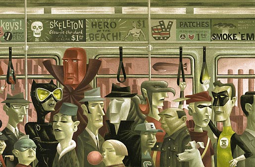
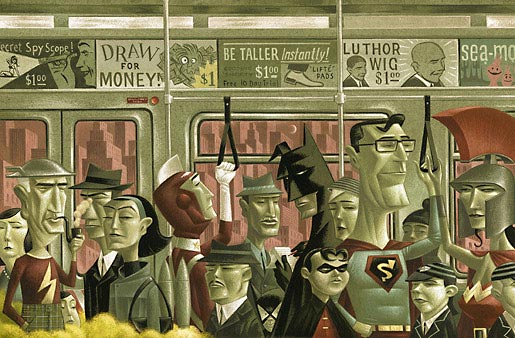
about the saturation of superheroes in contemporary popular culture.
Oscar Palmer: I’m assuming you knew beforehand that this was going to be a collection of six books, so what I’d like to know is: did you plan an overall design for the collection right from the start or you just had some general ideas which you then applied accordingly to each and one of the books?
Dean Gorissen: The series was always planned to be six books. Martin Hughes, Publisher at Affirm Press, certainly wanted an overall link for the series, but I don’t think either of us quite knew what that would be at the beginning. It was a big leap of faith on his part, really. I’d done a number of editorial illustrations for Martin a few years before, when he was editor of The Big Issue Australia, but generally figurative stuff, painted. Stylistically nothing like the book series. Actually, come to think of it, he originally rang up to ask if I knew of anyone who might be suitable! I didn’t get any direct design guidelines at all but we did discuss it a lot, more for the emotional note we wanted to hit. I think the only thing Martin was sure of early on was that he didn’t want to have a series logo for «Long Story Shorts» on the cover, back or front.
We were really trying to find a balance between each book being able to stand alone, retaining its own integrity, while clearly being part of a series with an overall cohesive aesthetic. Whether that was typographically, thematically or stylistically was up in the air. Early on, after reading one story of the first manuscript, I’d thought of the series as maybe in very different illustrative styles, but with a cohesive typographical and design approach, which Martin was open to. So I approached it in the usual way, conceptual scribbles, roughs, got the paints out, even started playing with photo montage and manipulation. But as soon as I’d done a first draft of the first cover it didn’t take long to realise it would set a precedent that would trap the whole series. So I threw the whole approach out, which was heartily endorsed and encouraged by Martin, and started again. It took a bit of an attitudinal shift to really get onto it. I realised I’d approached it solely as an illustrator, focusing on one aspect, and that I really needed to view it as a designer. Affirm sent the full manuscript of the first book, Under Stones and I just immersed myself in it. Once I connected with it emotionally and intellectually, the tone just presented itself and I started to get a sense of the series as a whole. I drafted up a template for the other cover elements, front and back and set some type parameters for title and author, then just sat down without roughs or scribbles, just some thoughts and a mouse, did it in a fairly intense burst and sent it off to Martin and series editor Rebecca Starford. The response was overwhelmingly positive and personally I was bursting with excitement to do the next one. I chose different fonts for each book title, again trying to enhance each books individual identity, but there’s an overall typographical similarity in terms of weight, spacing and size. And on each spine is a letter that on completion of the series lines up to spell out ‘shorts’. Which sounds kind of gimmicky, but works a treat for a sense of completion without overwhelming the thing. We were really keen to give the series a sense of it being a crafted, encapsulated series that was a bit of an event, something to value, a bit of a collectors item.
OP: For all these covers you somewhat departed from your usually recognizable style, renouncing to your trademark «cartoony figurativism» (so to speak) and dealing instead mostly with objects, even getting close to abstract forms. Why and how did you choose this particular style for this particular collection? Did you think maybe the less figurative the more evocative the covers would be?
DG: «Cartoony figurativism», that’s perfect, I wondered what it was called! There were a number of factors in play at the time. I was restless as an illustrator, feeling stale, and a bit stylistically straight jacketed. As an illustrator there’s often (or maybe I just think there is) a certain pressure to be a known quantity by the marketplace. I totally understand why, but it was feeling increasingly limiting. My wife and I have a small design studio, Room 44, and I’d begun doing the odd design job here and there. So from a personal point of view, I’d been longing for a project like this for a while, something that offered the opportunity to transcend the usual stuff and craft a whole series as a designer as well as illustrator. Where you could evaluate the job from a different point of view and trust your own instincts and drive the thing more. So I suppose I chose the style because it felt right and I could. Being overly figurative just seemed as if it would spell out the emotional reaction a viewer is supposed to have, not leave any room for a potential purchaser to be engaged or intrigued. It was incredibly liberating actually.
Once I’d established a tone and approach with the first one, I just set a rule that I would do no roughs, just read the manuscripts, post, make a few notes and just go straight to the cover templates and start drawing, with a mouse, not stylus. So there’s no sketches anywhere, just the odd scrawl or note on a manuscript to remind me of a thought.
OP: I’m guessing that, with these covers, you didn’t choose to illustrate specific passages from the books, but rather to convey a particular mood. For instance, I don’t know if there’s actually a bike in Nineteen Seventysomething, but your illustration sums up beautifully that feeling of old days and times past. Do you think is better and more effective to be evocative (that word again!) than purely illustrative?
DG: I don’t have a general rule for anything really. I try to approach any assignment on it’s own inherent character. It just seemed that a basically visceral response was the right way to go, reducing elements to symbols give the reader some credit and leaving interpretation open to some degree. You’re right, there’s no literal visualising of specific passages, though there’s a couple that are inspired by certain scenes. And sometimes talking with the author, helped shape things too. All I know for sure is that in order to do them honestly, I needed to read the books and so it was the books both individually and as a series that basically defined the response.
 |
 |
OP: Could you elaborate a bit the thinking that went behind each one of the covers? How did you get to the final images? Let’s start with Under Stones.
DG: Under Stones contains a passage that inspired the cover image, though it’s not a literal representation. Under Stones was written by Bob Franklin, an actor and stand up comedian, and though there was often something intimidating about Bob’s stage persona, his book is sort of borderline horror, not in a blood soaked way at all, but in it’s unsettling/ghastly/dread revelations about seemingly ordinary people. It really creeps up and scares the crap out of you. Martin had described it as «sort of horror lite» and later, when reading the first story, well into it, I’m thinking, «what was he talking about? Yes it’s involving, personal, gets under your skin, but… Ohhh, ohhhmigod!». So it was important to visualise that feeling and create some intrigue to try and see what was under those stones. There’s a scene in some wetlands in the book that just sends chills. It was full of a sense of unknown and ancient wrongs, the stuff that’s buried at the heart of colonial cultures, and I wanted to capture that in some way, and wanted the drawing style to nod to it, too. This was the first book in the series and (after the false start of the first attempt) it came very quickly, really in a bit of a torrent after reading the book. If I could liken it to anything it was almost the stream of consciousness you get when fully immersed in writing something. I don’t think it changed substantially from that, though I think I did a version with the sky predominantly white.
OP: And Nineteen Seventysomething?
DG: That cover grew out of a long telephone chat with author Barry Divola. We’re the same age, grew up in the 70’s, and so much of what he wrote made me laugh in recognition. We sort of bonded over that iconic bike, the dragster, and the experience of the suburbs. And I put stuff in there for me, too, like that barely visible flying saucer top right, because I can remember often waiting and hoping one would arrive and just take me away! A very different book to Bob’s and so the approach was much gentler. It’s nostalgic, without wearing rose coloured glasses. Stylistically, I was heavily under the influence of the curved geometric wallpaper I remembered from our lounge room! I did a couple of takes on this to get the tone right.
 |
 |
OP: Speaking of tone, Known Unknowns by Emmett Stinson has one of the moodiest covers I’ve seen in a long time.
DG: Thanks! That cover really comes from the book as a whole. Not only is it definitely post 9-11, but there’s a kind of inevitable disintegration that pervades. It’s lonely. And the smoke theme recurres throughout, whether it’s cigarettes, a joint, a barbeque or a car exhaust. I don’t know if that was deliberate on Emmett’s part or not, but I read it in one sitting, and drew it. I just knew what it was going to be, and once I got satisfied with the shape of the smoke/flag device it basically drew itself. I don’t remember having any internal questions about it. I just felt like a vessel for it. I’m not sure if I’m remembering this right, but think Martin was a bit unsure about it, or was concerned from a shelf point of view that the palette was too dark, something like that. I felt very strongly, though, that it was right.
OP: Having Cried Wolf.
DG: Gretchen Shirm’s book is all about interconnected lives, stories that intertwine often lightly but very definitely, revolving around a small coastal town. Initially I really had to rush with this one. If I remember right, we needed to get a cover out in a couple of days to book a spot in the publishing cycle. Read it, too quickly, and I wasn’t satisfied with how I was filtering it. I’d basically expedited an information input instead of reading it. Anyway, I overcompensated for my uncertainty by producing a whole bunch of options that were okay, but fundamentally as expedited as my reading had been. I couldn’t let it lie, though, so after some begging from me and wheedling from Martin we ended up getting an extension, I could read the book properly, felt it and found its voice. The sense of detail, and a really multi-layered reality is astounding. Gretchen, I found out a month or so later, is relatively young, only 30 when the book was completed and I remember being pretty stunned that someone of that age could have such an innate understanding of how lives can play out, the journey of long term relationships, emotional implications, consequences, actions and reactions that reverberate through a family or community and the unresolved nature of our lives.
 |
 |
OP: I think Bearings by Leah Swan was next?
DG: Yeah, that was easily the quickest cover out of the whole series. It was just one of those perfect moments. The manuscript arrived, the deadline was close but not too close, read it over a couple of nights, sat down one morning and drew. It’s very powerful work, the book, and really is about storm tossed lives, both metaphorically as well as environmentally. Like Emmett’s, there was really no question in my mind about it. The paramount thing to me was, I wanted to feel those waves. I was immensely satisfied with it, and the reaction at Affirm was immediately positive.
OP: And what about the final book in the series, Irma Gold’s Two Steps Forward?
DG: Two Steps Forward is very much about difficult, often heartbreakingly sad lives, but with a resolute core to find some kind of happiness or kindness. The reaction from Martin and Rebecca was again quite immediate: they hated it a lot. Which I was kind taken aback by. But they were right. I’d missed the core of it. After Martin and Rebecca’s initial reaction to my first attempt, like always they gave me ample opportunity to sell them on it or defend it, and I was unable to with any real conviction. Always a sure sign that I don’t really believe in something! Martin suggested I go back and reread it. Often the stories concern children, the fractured relations between children and parents, especially when circumstances change. And how we deal with the tragedies of life, the pain of loss. I got real sense that the adults in the book were very much still children, like we all are, stumbling and unsure, seeking comfort even when none is in sight, learning and growing. It’s often unbearably sad and at the same time beautifully uplifting. So even though I needed to stick to the subdued tones, flat colours, I wanted to counterpoint that with these childhood sketches, stretching across the landscape, moving toward something unseen.
 |
 |
OP: Having designed and illustrated these covers all by yourself, and having illustrated in the past for other designers, could you elaborate a bit on the pros and cons of working alone on such a project?
DG: I can’t think of any cons. It’s all pros. Except it never felt that I was working alone. Absolutely I felt responsible for the visual approach of the series, but having direct communication with decision makers who both have a commitment and connection with the work beyond it being a bureaucratic assignment and who have a faith in your ability is a rare thing, and was really the key to the whole thing. And that trust allows some flexibility too. It lets you get it wrong sometimes, and pushes you to do it better without being in any way proscriptive and it lets you defend the solutions that you believe in passionately. There weren’t any other levels adding this or subtracting that, running it by multiple departments for approval or ticking this or that box and ultimately sucking the life out of it. Martin and I spoke a lot, and would exchange thoughts often robustly, but always to the ultimate betterment of the work.
OP: It’s funny, but with book design having become so sadly standarized and so imagebank-dependant (here in Europe at least), the first thing that came into my mind after seeing your covers for Affirm Press was not the work of other book designers but that of sleeve designers like Jim Flora and the recently departed Alex Steinweiss; not as retro pastiche but really as a contemporary evolution of that kind of design they pionereed.
DG: That is so not misguided! I absolutely aspire to their example. Both Steinweiss and Flora seemed not only to have a fidelity to the eccentricities of each task, but the ability to emotionally attune themselves to it too. I love the sophistication and elegance of Alex Steinweiss, and I‘m drawn to Jim Flora in particular, because while he could be abstractedly evocative (that word again!) he could really cut loose with some beautifully cool cartoony stuff that just burst with energy and enthusiasm, and all without losing what was essentially ‘him’. It’s an honour to be mentioned in the same paragraph.
