Dean Gorissen: notas emocionales
Dean Gorissen lleva casi veinte años trabajando como ilustrador y diseñador en su Australia natal. Además de colaborar en revistas como Child, Australian Family Physician, American Lawyer, Sunday Life Magazine o The Big Issue, también ha diseñado personajes de dibujos animados (como los de la serie Deadly) y ha ilustrado varios libros infantiles, entre los que destacan I Got a Rocket!, My Dad’s a Wrestler y Ten Little Elvi. Este mismo año, ha publicado su primer libro escrito e ilustrado completamente en solitario: The Search for Bigfoot Bradley. Uno de sus trabajos recientes más interesantes y personales fue la realización de las cubiertas para una colección de seis títulos llamada Long Story Shorts, publicada por la editorial australiana Affirm Press. Fue a raíz de este último proyecto cuando decidí entrevistarle para charlar acerca de la creación de sus elegantes y llamativas portadas. Para saber más sobre Dean, no dejéis de visitar su blog.
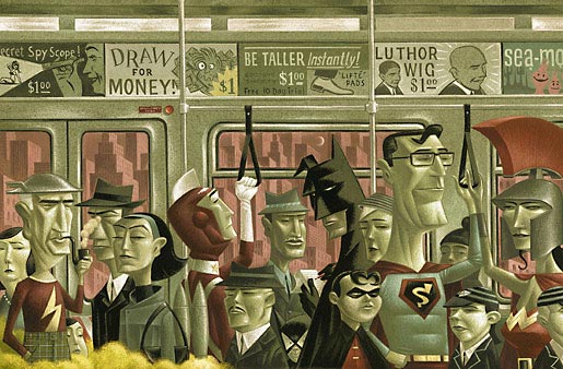
sobre la saturación de superhéroes en la cultura popular.
Cultura Impopular: Asumo que desde el primer momento debías saber que el proyecto Long Story Shorts iba a constar de seis títulos, de modo que lo que me gustaría saber es: ¿ideaste un diseño general para toda la colección desde el primer momento o te limitaste a plantearte un par de líneas generales que luego pudieras ir aplicando a cada uno de los libros?
Dean Gorissen: Efectivamente, siempre supe que serían seis libros. Martin Hughes, editor de Affirm Press, quería por supuesto un nexo común para toda la colección, pero no creo que ninguno de los dos supiera cuál debía ser en un principio. Francamente, debo decir que depositó su fe en mí completamente a ciegas. Un par de años antes había realizado unas cuantas ilustraciones para él, cuando aún trabajaba como jefe de redacción en la edición australiana de la revista The Big Issue, pero la mayoría en un rollo más figurativo, pintado. Nada que ver estilísticamente con la serie. ¡En realidad, ahora que lo pienso, en principio me llamó para preguntarme si conocía y podía recomendarle a alguien adecuado para el trabajo! No recibí ninguna instrucción detallada respecto al diseño, pero sí que hablamos un montón, principalmente para ponernos de acuerdo en la nota emocional que queríamos pulsar. Creo que lo único de lo que Martin estaba convencido desde un principio era de que no quería que la serie tuviera un logo, ni en la cubierta ni en la contra. Lo que de verdad pretendíamos encontrar era un equilibrio en el que cada libro fuese capaz de definirse por sí mismo, conservando su integridad, y que a la vez resultara evidente que formaba parte de una serie dotada de una estética general cohesionada. Si la constancia debía ser tipográfica, temática o estilística, era algo que todavía estaba por decidir.
Al principio, tras haber leído un relato del primer manuscrito, visualicé la serie como un compendio de estilos de ilustración muy distintos, unidos por un diseño y un enfoque tipográfico único, lo cual le pareció bien a Martin. De modo que abordé el trabajo de la manera habitual: esbozos conceptuales, bocetos, saqué las pinturas e incluso empecé a juguetear con fotomontajes y manipulación digital. Pero tan pronto como hube terminado el primer borrador para la primera portada, no me llevó demasiado tiempo darme cuenta de que sentaría un precedente que enclaustraría toda la colección. De modo que, apoyado y animado por Martin, renuncié a todo aquel enfoque y volví a comenzar de nuevo. Meterme de lleno en el trabajo requirió de un ligero cambio de actitud por mi parte. Me di cuenta de que había estado enfocándolo únicamente como ilustrador, centrándome en un solo aspecto de las portadas, cuando en realidad debía afrontarlo como diseñador. Desde Affirm me enviaron el manuscrito completo del primer libro, Under Stones, y me limité a sumergirme por completo en su lectura. Una vez hube conectado emocional e intelectualmente, el tono adecuado se reveló prácticamente solo y comencé a tener una idea general para toda la serie. Preparé una plantilla para el resto de los elementos de portada y contraportada y fijé ciertos parámetros tipográficos para el título y el nombre del autor, después me limité a sentarme sin bocetos ni esbozos, armado únicamente con un par de ideas y un ratón. Completé la cubierta de un tirón bastante intenso y se la envié a Martin y a Rebecca Starford, la directora de la colección. La respuesta fue abrumadoramente positiva y personalmente me emocioné de tal manera que no veía el momento de empezar con la siguiente. Al final escogí fuentes distintas para cada título, nuevamente con el propósito de remarcar la identidad individual de cada uno de los libros, pero todas siguen un esquema similar en cuanto a peso, espacio y tamaño. Y en cada uno de los lomos aparece una letra que, al juntar toda la colección, forma la palabra «shorts». Lo cual suena un poco facilón, pero es francamente eficaz a la hora de darle cierta cohesión sin resultar excesivamente abrumador. Estábamos muy empeñados en que la colección transmitiese la idea de que estaba pensada con cariño, una serie encapsulada que era un pequeño evento, algo que atesorar, un poco objeto de coleccionista.
CI: En todas estas portadas te has apartado de tu estilo más reconocible, renunciando a tu característico «figurativismo caricaturesco» (por así decirlo) para tratar principalmente con objetos y figuras que lindan con lo abstracto. ¿Cómo y por qué elegiste este estilo en particular para la colección? ¿Pensaste quizás que cuanto menos figurativas más evocadoras resultarían las portadas?
DG: «Figurativismo caricaturesco» me parece una definición perfecta. ¡Me preguntaba cómo llamarlo! En aquel momento entraron en juego varios factores. Había llegado a un punto en el que me sentía un tanto incómodo con mi carrera de ilustrador, como si hubiera llegado a un punto muerto y estilísticamente un poco encorsetado. Como ilustrador a menudo existe cierta presión para convertirte en un factor conocido por el mercado (o a lo mejor sólo imagino que existe, pero me afecta igual). Comprendo perfectamente por qué, pero cada vez me iba sintiendo más limitado. Mi esposa y yo tenemos un pequeño estudio de diseño, Room 44, a través del cual había comenzado a realizar trabajos ocasionales aquí y allá. De modo que desde un punto de vista personal, llevaba algún tiempo deseando encontrar un proyecto como este, algo que me ofreciese la oportunidad de trascender los encargos habituales para crear toda una colección como diseñador a la vez que como ilustrador. Que me permitiese evaluar el trabajo desde un punto de vista diferente y confiar en mis instintos para llegar hasta algo nuevo. De modo que supongo que escogí este estilo porque me parecía el correcto y porque además podía. Creo que tirar demasiado de figurativismo habría explicitado demasiado la reacción emocional que debían suscitar estas imágenes en el lector, renunciando a dejar espacio para que el potencial comprador se sintiese intrigado o atraído. En realidad fue un proceso completamente liberador. Una vez hube establecido un tono y un enfoque para la primera portada, me puse como regla no realizar bocetos, sólo leer los manuscritos, tomar unas cuantas notas y después atacar directamente la cubierta, comenzar a dibujar directamente, con el ratón, no con el lápiz. De modo que no tengo ni un solo boceto, sólo algún garabato o nota sobre los manuscritos para acordarme de alguna idea en concreto.
CI: Por algún motivo me da la impresión de que no decidiste ilustrar ningún pasaje en concreto de los libros en las portadas, sino que más bien optaste por transmitir una sensación. Por ejemplo, no sé si las bicis juegan un papel prominente en Nineteen Seventysomething, pero tu ilustración evoca perfectamente esa idea de memoria de un tiempo pasado. ¿Crees que como portadista tiendes más a ser evocador (¡otra vez esa palabra!) que puramente ilustrativo?
DG: En realidad no tengo una regla general para nada. Intento abordar cada encargo según sus propias características inherentes. Simplemente me pareció que una respuesta básicamente visceral era el modo adecuado de proceder; reducir los elementos a símbolos permite que el lector aporte algo de sí mismo al haber dejado una interpretación hasta cierto punto abierta. Tienes razón, no hay una visualización literal de pasajes específicos, aunque un par de ellas sí que están inspiradas por ciertas escenas. Y en ocasiones hablar con el autor también ayudó a darles forma. Lo único que sé es que para poder hacerlas con sinceridad, debía leer los libros, de modo que fueron los libros de manera individual y como conjunto los que básicamente definieron la respuesta.
 |
 |
CI: Bueno, teniendo en cuenta que ninguno de los libros son demasiado conocidos fuera de Australia, ¿te importaría que los repasemos uno por uno? ¿Cómo fuiste llegando a las imágenes finales? Empecemos por Under Stones.
DG:Under Stones contiene un pasaje que inspiró la imagen de cubierta, aunque no sea una representación literal. El autor, Bob Franklin, es actor y cómico de escenario, y aunque ya había algo a menudo intimidatorio en el personaje escénico de Bob, su libro bordea por momentos el horror, no en un aspecto sangriento, sino en su tendencia a revelar detalles inquietantes, macabros y terribles acerca de individuos aparentemente corrientes. Realmente va arrastrándote hasta que finalmente te acojona por completo. Martin me lo había descrito como «una especie de horror ligero» y más tarde, mientras estaba leyendo el primer relato, iba pensando: «¿A qué se refería? Vale, es absorbente, personal, inquieta un poco, pero… ¡Ohhh, ohhdiosmío!». Así que me parecía importante visualizar esa sensación y crear algo de intriga para ver qué hay bajo esas piedras. En el libro hay una escena en una especie de pantano que simplemente provoca escalofríos. Rebosaba una sensación de lo desconocido y de antiguos males, todo lo que hay enterrado en el corazón de las culturas coloniales, y quería capturar eso de algún modo, y quería que el estilo de dibujo también lo manifestara. Era el primer libro de la serie y (tras el falso arranque de mi primer intento) surgió muy rápido, en un verdadero torrente tras haber leído el libro. Si pudiera compararlo con algo sería casi con el arroyo de conciencia que te arrastra cuando de verdad te sumerges en la escritura de algo. No creo que cambiase de manera substancial a partir de aquello, aunque me parece que hice una versión con el cielo predominantemente blanco.
OP: ¿Y Nineteen Seventysomething?
DG: La portada de Nineteen Seventysomething surgió de una larga conversación telefónica con el autor, Barry Divola. Tenemos la misma edad, crecimos en los setenta, de modo que mucho de lo que ha escrito me hizo reír por identificación. Más o menos nos pusimos de acuerdo en esa bicicleta icónica, la dragster, y la experiencia de los suburbios. También incluí detalles muy personales, como ese platillo volante apenas visible en la esquina superior derecha, porque recuerdo haber esperado y deseado a menudo que llegase uno y simplemente se me llevara. Es un libro muy distinto al de Bob, de modo que el enfoque fue mucho más amable. Es nostálgico, pero sin ponerse unas gafas con los cristales rosa. Estilísticamente, me sentí muy influido por el papel de pared curvado y geométrico que recordaba de nuestra sala de estar. De esta hice un par de versiones para captar el tono correcto.
 |
 |
OP: Hablando de tono, Known Unknowns, de Emmet Stinson, tiene una de las portadas más atmosféricas que he visto últimamente.
DG: ¡Gracias! Esta cubierta sí que surge del libro como un todo. No sólo trata decididamente sobre las consecuencias del 11-S, sino que además hay una especie de desintegración inevitable que lo impregna todo. Es solitario. Y el humo es un tema recurrente, ya sea en cigarrillos, en un porro, en una barbacoa o en un tubo de escape. No sé si fue deliberado por parte de Emmett o no, pero lo leí de una sentada y lo dibujé. Simplemente supe cómo iba a ser, y tan pronto como me sentí satisfecho con la forma del humo/bandera, básicamente se dibujó sola. No recuerdo haber tenido ninguna duda al respecto. Me sentí como un simple conducto para la ilustración. No sé si lo recuerdo correctamente, pero me parece que a Martin no acababa de convencerle, o le preocupaba que desde un punto de vista comercial los colores fueran demasiado oscuros o algo así. Sin embargo yo tenía la inquebrantable sensación de que así estaba bien.
OP: Having Cried Wolf.
DG: El libro de Gretchen Shirm trata de vidas interconectadas, historias que se interrelacionan a menudo de manera ligera pero muy definida, ambientadas en una pequeña ciudad costera. Al principio tuve que darme prisa para liquidarla. Si no recuerdo mal, debíamos tener la portada terminada en apenas un par de días para asegurarnos un hueco en el ciclo de publicación. Lo leí demasiado rápido y no me sentía satisfecho con cómo lo estaba filtrando. Básicamente me había limitado a absorber información en vez de leerlo. En cualquier caso, sobrecompensé mi inseguridad produciendo un montón de opciones que no estaban mal, pero fundamentalmente tan aceleradas como mi lectura. Sin embargo no podía dejarlo estar, de modo que tras algunos ruegos por mi parte y la intervención de Martin, terminamos consiguiendo una extensión del plazo, pude leer el libro adecuadamente, lo sentí y encontré su voz. El sentido del detalle de una realidad con muchas capas es sorprendente. Gretchen, según averigüé un mes más tarde, es relativamente joven, sólo tenía 30 años cuando terminó el libro, y recuerdo haberme sentido asombrado de que una persona de esa edad pudiese tener tal innata comprensión de cómo pueden ir desarrollándose las vidas, el viaje de las relaciones a largo plazo, implicaciones emocionales, consecuencias, acciones y reacciones que reverberan a través de una familia o una comunidad y la naturaleza irresuelta de nuestras vidas.
 |
 |
OP: Creo que el siguiente fue Bearings, de Leah Swan, ¿no?
DG: Sí, esa fue probablemente la portada más rápida de toda la colección. Fue uno de esos momentos perfectos. Llegó el manuscrito, la fecha de entrega era cercana, pero no demasiado. Me lo leí en un par de noches, me senté una buena mañana y la dibujé tal cual. Es una obra muy potente, la novela, y en realidad habla de una serie de vidas azotadas por una tormenta, tanto metafórica como real. Al igual que con el libro de Emmett, no sentí la menor duda acerca del concepto. Lo principal para mí era sentir esas olas. Me sentí inmensamente satisfecho con el resultado y la reacción en Affirm fue inmediatamente positiva.
OP: Y llegamos al último título de la serie, Two Steps Forward de Irma Gold.
DG:Two Steps Forward habla en gran medida de vidas difíciles y a menudo desconsoladoramente tristes, pero con un corazón empeñado en encontrar alguna especie de felicidad o amabilidad. La reacción de Martin y Rebecca fue una vez más muy inmediata: odiaron la cubierta por completo. Lo cual me dejó bastante patidifuso. Pero tenían razón. Había pasado por alto el tema básico. Tras la reacción inicial de Martin y Rebecca a mi primer intento, como siempre me dieron amplias oportunidades para intentar convencerles y venderles la idea, pero fui incapaz de hacerlo con demasiada convicción. ¡Siempre un indicio claro de que en realidad no crees en lo que has hecho! Martin sugirió que lo leyese de nuevo. A menudo en las historias intervienen niños, las relaciones fracturadas entre padres e hijos, especialmente cuando las circunstancias cambian. Y cómo tratamos con las tragedias de la vida, el dolor de la pérdida. Me dio la impresión de que los adultos del libro seguían siendo en gran medida niños, como lo somos todos, tambaleantes e inseguros, buscando consuelo incluso cuando no lo hay, aprendiendo y creciendo. A menudo resulta insoportablemente triste pero al mismo tiempo bellamente inspirador. De modo que aunque necesitaba atenerme a los tonos apagados y los colores planos, quise ofrecer un contrapunto mediante esos dibujos infantiles que se diseminan sobre el paisaje, dirigiéndose hacia algo invisible.
 |
 |
OP: Tras haber trabajado como ilustrador para otros diseñadores en el pasado, ¿cuáles dirías que son los pros y los contras de abordar en solitario un proyecto de estas características?
DG: No se me ocurre ninguna desventaja. Todo han sido ventajas. Sólo que nunca he sentido que estuviera trabajando solo. Por supuesto me considero responsable del enfoque visual de la colección, pero haber tenido comunicación directa con dos personas que toman decisiones, que sienten una conexión y una dedicación para con las obras más allá del mero encargo burocrático, y que tienen fe en tus habilidades, no es lo habitual, y esa fue en realidad la clave de todo. Además esa fe también aporta cierta flexibilidad. Te permite cometer errores en ocasiones, y te impulsa a hacerlo mejor sin constreñirte demasiado y te permite defender las soluciones en las que crees apasionadamente. No ha habido más niveles de intervención ni me he visto obligado a presentar las portadas a múltiples departamentos para que las aprueben ni a cumplir tales o cuales requisitos comerciales que en última instancia le habrían arrebatado la vida. Martin y yo hablamos cantidad de veces e intercambiamos ideas a menudo con robustez, pero siempre con el objetivo de mejorar el trabajo.
OP: Es curioso, pero teniendo en cuenta lo estandarizado y dependiente de bancos de imágenes que ha acabado siendo el diseño literario, lo primero que me vino a la cabeza tras ver tus portadas para Affirm Press no fue el trabajo de otros diseñadores de libros sino el de antiguos ilustradores de portadas de discos, como Jim Flora y el recientemente fallecido Alex Steinweiss. No como un pastiche nostálgico, sino realmente como una evolución contemporánea de ese tipo de diseño del que ellos fueron pioneros.
DG: ¡No andas demasiado equivocado! Aspiro por completo a seguir su ejemplo. Tanto Steinweiss como Flora parecían tener la capacidad para resaltar las excentricidades de cada uno de sus trabajos y a la vez para establecer un vínculo emocional con ellos. Me encanta la sofisticación y la elegancia de Alex Steinweiss, y me siento atraído por Jim Flora en particular, porque a pesar de que era capaz de resultar evocador de una manera abstracta, también podía soltarse el pelo y dibujar esas maravillosas figuras caricaturescas que reventaban de energía y entusiasmo, todo ello sin perder lo que era esencialmente «suyo». Es un honor verme mencionado en el mismo párrafo.
